October 01, 2016
“Hand-painted signs are such a unique and beautiful aspect of our culture. A culture I would like to see continue and thrive. But I also understand some of the challenges that the regional corporations face that may lead them to remove signs before their date has passed, as fallen, outdated signs lead to clutter and litter. So it was very important to me to attempt to find a solution to this that still respects this part of our design culture.”
I confess. I have had a love affair with books that spans decades.
When I was about 3 years old, I would memorise stories so I could ‘pretend read’ them and turn the pages all by myself.
As I grew, learned to read, I developed an appreciation for book making, paper making, the materials and textures, binding methods, letterforms. I collected stationary items, planners, journals, sketchbooks, well-designed books and books about books! Eventually, I was not only making my own books but my own bookcases and book carriers. Basically, all this is to say, that my younger self had a bit of an obsession with books.
Then came the digital revolution and I stopped going to the library to read and research. I stopped writing assignments by hand and typed instead. iBooks and Kindle became my main bookshelf, iCal became my daily planner and Paper 53 my convenient sketchbook. In more instances than I’d care to admit, I’ve caught myself swiping the middle of a paperback, expecting the text to move over so I could continue reading. New habits die hard.
But despite the shift to digital, I’ve always kept physical journals and sketchbooks. Somehow the connection between my brain through my hand to paper flows better without a screen.
For my favourite books, the hard-copy is a must! There’s just something so indulgent about the smell, feel and experience of interacting with a physical book: the scent of leather, card-board, old paper, new paper, ink, glue and other materials; the feel of a delicate paper, a heavy weight textile, an unexpected texture or non-traditional material; the lingering taste of paper when I lick my finger to turn a stubborn page and then there are the elements of surprise – piercings, patterns, embossing, prints, the playfulness of layered papers, pop ups and much more.
— Oh the sensory decadence of a good book!
It should then come as no surprise that books have popped up in my life once again.
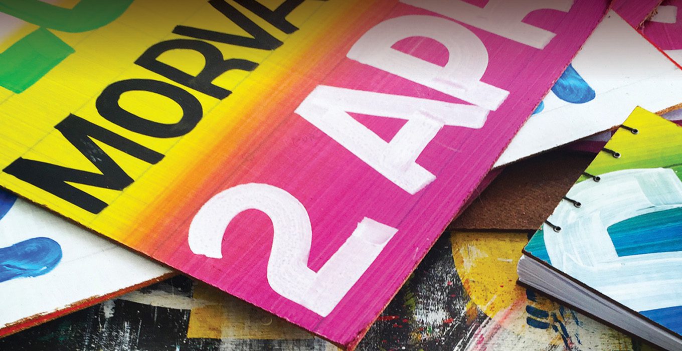
Last year, on a whim, I found myself buying book-making materials and this year I used those tools and materials to make a book as a birthday present for my friend, Kriston Chen. Kris is a designer who blogs about and collects local hand-painted signs, and he’s a fan of Trinidadian sign-painter Bruce Cayonne’s work. So I decided to make Kris a book using an outdated Cayonne sign.
I really wasn’t really sure what his reaction would be: “You made a book out of an old sign!” or “You destroyed a perfectly good sign!” ,but I figured that either way it would be meaningful so I bit the bullet and set about making a sign book. I managed to get a sign donated from a mutual friend, artist, Josh Lue Chee Kong with the promise of a free sign book for Josh if my book-making attempts worked out.
I carefully folded all the pages by hand, outlined a stencil for use as a window, placing it on the board and moving it around to find compositions I liked. I can still remember the nervousness I felt shifting the stencil over the sign, penciling in the outline of the cover and putting blade to board as I slid an old Xacto box-cutter along a metal ruler, hoping it wouldn’t slip and slice off my thumb. The visions of spurting blood because I’d hit an artery were way too vivid and I came to the conclusion that this book-making business was dangerous work! However it was worth it when I saw that the crops of letters made beautiful compositions.
The small covers provided a new lens through which to view the details of hand-painted signs. Assertive brush strokes, bold colours, playful shapes, authentic textured effects and perfectly imperfect pencil lines from the hands of the sign painter, were the focus.
The covers felt Caribbean. — Somehow the spirit of everyday Caribbean life, music and culture made it into every little piece of the sign that became a book cover.
With every book I made, the design evolved as I searched for something that I liked.
The first books were bare bones as I experimented with how best to sew the pages and attach the covers. At first, the pages bunched and warped as I figured out how tight/loose to sew them. They weren’t perfect, but I got better at sewing them.
The second book had a crackled-lacquer effect pointed on top; the third had no additional paint effects on the covers but had eyelets installed in the holes of the cover-board. Form followed function in the use of the eyelets. The eyelets protected the waxed thread from getting dirty as I pulled it through the cover board holes.
By my fourth book, I was experimenting with coloured edges and insides of the cover boards. Eventually I settled on painted insides and edges for the cover boards, black eyelets and black waxed linen thread. The combination worked for me as the black complimented black details found in many of my composed crops.
Each book was extremely labor intensive, with a lot of cutting, folding, piercing, collating, detailing, painting and sewing. It took over 4 hours to make one book but it was worth it to see the results of a completed book. The final product had appealing details and suited my love for a utilitarian design approach, up cycling and hand-done elements.
By the time my friend’s birthday arrived, I had book options for him to choose from and luckily for me, he loved his present! In fact, he liked it so much that he showed it to a number of other people, some of whom were interested in buying one.
My plan had never been to make and sell sign books (the hours and materials seemed to make production impractical) but the interest was there so I accepted the challenge.
Since the first set of hand-made books, I’ve been exploring methods for faster and more affordable production of sign books. —Goodbye box cutter and bloody fingers!
I’ve also partnered with Bruce Cayonne and we’ve settled on ways for me to collaborate with him in order to source a steady supply of outdated signs and clear the streets of old signs.
Hand-painted signs are such a unique and beautiful aspect of our culture. A culture I would like to see continue and thrive. But I also understand some of the challenges that the regional corporations face that may lead them to remove signs before their date has passed, as fallen, outdated signs lead to clutter and litter. So it was very important to me to attempt to find a solution to this that still respects this part of our design culture.
The Signbook is an experimental design solution, inspired by my love for books and design, to create something useful with a positive environmental impact, because design is so much more than making pretty things, (though I do love pretty things). Design is about finding a beautiful and functional solution to a problem.
The first set of mass-produced signbooks is scheduled to be out by November of this year.
To find out more about Debbie’s work and the Signbooks email: hello@destwick.com
Look for the hashtag #Signbooks on Instagram to follow the design process and to know when they’re available for purchase.
INTERVIEWER: DEBBIE ESTWICK